Packaging Aesop's bottles look like they came from a pharmacy because, chemically, they kind of need to.
The amber glass is real UV protection for the actual ingredients inside. It also happens to be the exact color that makes a $40 lotion feel clinical instead of decorative.
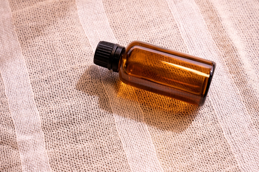
Every Aesop product sits in the same near-black amber glass, plain white label, no illustration, no gradient, no gold foil, and it's looked essentially the same since the brand's earliest days. That consistency is unusual on its own. Most beauty brands redesign every few product cycles, chasing whatever packaging trend is currently reading as premium. Aesop just kept the same amber bottle. But the color isn't sitting on top of the formula as a style choice. It's doing a real, measurable job.
Amber glass is pharmaceutical-grade for a specific reason: it filters out the light wavelengths that degrade light-sensitive botanical extracts, which lets a formula stay stable with fewer synthetic preservatives than it would otherwise need. When a bottle reads as "this looks like medicine," that's not a coincidence built by a design team chasing a mood board. It's the same glass a pharmacy would use, for the same reason a pharmacy would use it.
The brand's origin backs this up more than most beauty-brand founding stories do. Dennis Paphitis started what became Aesop in 1987, initially blending essential oils into hair products out of a Melbourne hair salon called Emeis, developing trial samples for actual clients before there was anything resembling a retail brand at all. The company was renamed Aesop in 1989. This wasn't a marketing team inventing an apothecary aesthetic from a brief. It was closer to the reverse: a small, formulation-first operation whose visual identity came later and mostly just described what the product already was.
Paphitis has been explicit, in interviews over the years, that Aesop was built on the idea that customers shouldn't be sold to in the usual sense, pushed a product with promises about what it'll do for them. The stated approach is to reveal value rather than perform salesmanship, and the stores, frequently designed in collaboration with different architects for each individual location, lean into the same apothecary-adjacent register as the bottles: quiet, materials-forward, deliberately avoiding the "big brand" sameness that chain retail usually reaches for. One line from coverage of the brand sums up the whole thing better than any tagline Aesop has used: Aesop is a philosophy that happens to sell skincare.
The "this looks like medicine" feeling isn't a coincidence. It's the same glass a pharmacy would use, for the same reason a pharmacy would use it.
Because that amber glass really does read as apothecary, lab, pharmacy, the aesthetic effect and the functional effect reinforce each other instead of fighting. A brand faking "clinical credibility" with tinted glass that serves no real UV purpose is borrowing a signal it hasn't earned, style copied from substance with none of the substance underneath. Aesop's version is borrowing the same visual signal, except the signal happens to also be true, which is the harder version of this to copy. A competitor can match the amber shade in an afternoon of sourcing. Matching "the color is load-bearing for the actual formula's shelf stability" means re-engineering the product itself, not just re-ordering glass from a different supplier.
The Tell Ask whether a design choice would survive contact with a chemist, not just a focus group. If a brand's clinical-looking packaging has zero functional relationship to what's inside, that's costume. If the look and the function are the same underlying decision, made for the same reason, that's closer to what Aesop is doing, and it usually shows up in small tells: consistent tinted glass across an entire line, minimal label copy, ingredient lists that read like a formulation sheet instead of a sales pitch.
My take A rare case of form and function being the literal same choice, not two separate choices that happen to agree with each other. Worth clocking specifically because most "clinical" beauty packaging is only ever playing dress-up.